準備素材:
針對網頁中圖片:
#放到<head>~<head>中
<script src="jquery-1.8.1.min.js"></script> <script src="jquery.retina.js"></script> <script type="text/javascript"> $(document).ready(function() { $('.retina').retina(); }); </script> |
#html:
這時jQuery會自動判斷,當是高解時,會自動將圖片換成-2x的高解圖片,並壓縮在指定的大小裡。
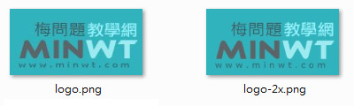
<img src="logo.png" width="160" height="80" class="retina" /> |
針對網頁中CSS背景圖片:
#放到<head>~<head>中
<style> .retinaDiv { width:160px; height:80px; background:url(logo.png) no-repeat; clear:both; margin-bottom:10px; } /* Retina圖片CSS放在這區塊中 */ @media screen and (-webkit-min-device-pixel-ratio: 2), screen and (min--moz-device-pixel-ratio: 2) { .retinaDiv { background: url(logo-2x.png); background-size:160px 80px; } } </style> |
#html:
當為高解析度的手機時,就會自動讀取@media中的CSS。
<div class="retinaDiv"></div> |
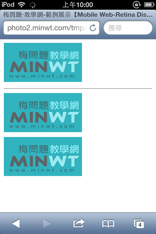
結果預覽:
當在高解析的裝置下,像是iPhone4s、iPhone4、iPod touch4,就會看到圖片依然保有, 高解析的影像,影像不再糊糊的。
[範例預覽] [範例下載]